Design
When I first learned about my high school’s journalism program, it was our print magazine, The Highlander, that lured me in.
I’ve always loved to design. It started with sewing, when my mom signed me up for a class at about the age of eight. Half of my closet still stores racks upon racks of dresses of my design and stitching, many bearing ribbons from the county fair or photos from annual fashion shows. I don’t have time to sew as often anymore, but my crimson Eversewn Sparrow 25 stays plugged in, a black spool and bobbin full and prepped for a fashion emergency or my occasional bursts of inspiration (usually for forgotten Christmas gifts…). Still, my skills come in handy whenever my brother rips his pants or my mom’s drawstring falls out in the wash.
However, sewing wasn’t my only creative outlet. Around the same time, I began drawing and painting, skills that come out during birthdays and other card seasons. Designing these cards also eventually led me to the digital side of design, likely for the lack of paint messiness. Canva was my gateway, and its premade layouts pushed me to join yearbook in seventh grade. By eighth, I was Editor-in-Chief. The role was a perfect fit: as a hardcore and self-overworked perfectionist, I was the best final check, double, triple…quintuple-checking alignments, font sizes, and color matching.
That attention to detail has since then translated seamlessly into magazine spread design. If I spend an hour building a layout, you can bet I’ll spend two more perfecting it. Scroll down to see some of these such layouts and learn about my design thought process!

Issue 5, Volume XVII — Sports
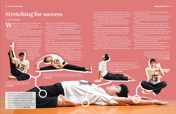
Stretching for success — While planning this spread, I knew that I wanted to showcase the diversity that stretching can have, so I tried to include several different stretches. I chose to give it almost a how-to style design, with markers connecting the different stretches to their respective stretched body parts in case readers wanted to try. One challenge I found was trying to fit all the captions in with so many photos for a two-page spread.
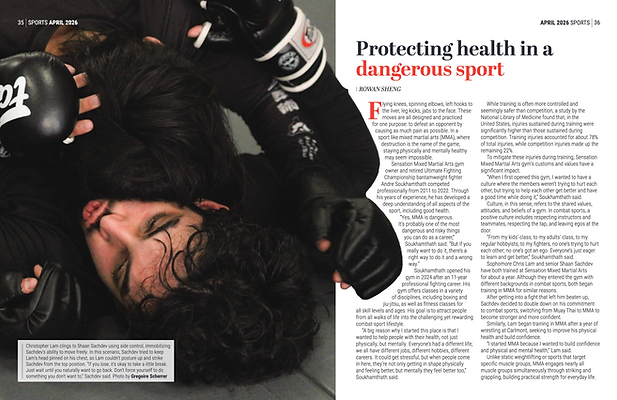
Protecting health in a dangerous sport — The theme of this issue was health, so I chose this photo of an MMA wrestler's bodily reaction to being taken down to try to showcase that. I received a lot of interesting photography for this spread so I used a gradient on the next page in order to fit all the text along with an extra large image.
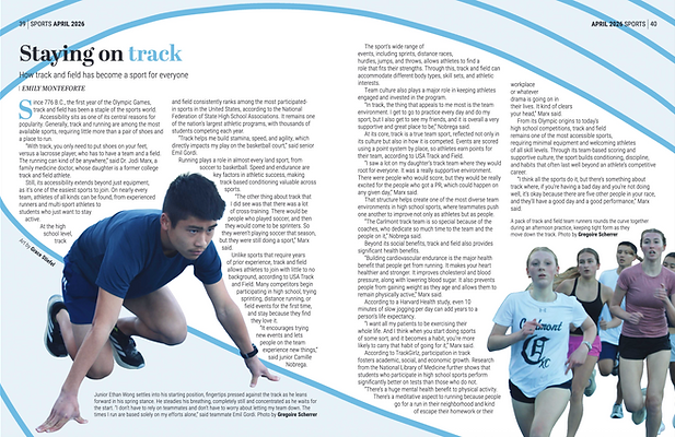
Staying on track — When I found out my writer's topic for this spread, I immediately knew I didn't want to do something with just photos. I turned to adding in art to make the spread more interesting to the eye with running not being the most exciting sport to photograph, while also giving it a leading line to follow throughout. Since the art was created first, getting the right camera angle was a struggle working with my photographer.

Issue 3, Volume XVII — Centerspread
All of the photos in this six-page spread were chosen to show the theme of this issue, which was human connection. I tried to emphasize collaboration and support between each community, through images of hugging, conversing, and rehearsing together. During the making of this design, a huge obstacle was the mass amount of text that was needed to be included, so I utilized many cutouts to leave more space for the word count.


.png)
Issue 1, Volume XVII — Features
Beyond the Bay — While designing this spread, I faced many restrictions with photo placement due to image quality and sizing, so I ended up finding that the long strips fit everything I wanted the best. We also decided to add an infographic to this spread because of how accessible its data was, and I worked closely with an artist to connect that data with illustration. I sent her a sketch with a similar ocean section design, and then arranged the different icons myself after she'd created them.
Going green in the city — With the focus of this article being on the refillables for reusables coming from this store, I knew I wanted the shelves and bottles of it to be a major focus, so I decided to do a large cutout of both, keeping the straight edge of the shelf for better legibility. I included the small photo on the second page because the chicken enclosure was another major part of the store's staying eco-friendly.


Issue 6, Volume XVI — Features
I never expected this to get to be published, as this was the first spread that I created using Adobe InDesign. Based on my first published feature, it was originally four pages, but later condensed to three to fit in the last issue as an evergreen spread. While designing it, I wanted to use a color that really stood out because the topic of it, swearing, is something that can be very jarring. I also experimented with color overlays and background elements to clearly connect the pages.
Large Ideas Advertisement
To design this ad, which was placed in two issues, I worked closely with the business, following their color scheme, text requirements, and contact information through several iterations. I used color to highlight the most important information for easy reader access, and rounded the corners for cohesiveness and a softer, more comfortable look.